Your optimization checklist, Part 1 - Inside AdSense
Looks like AdSense wants you to straighten up your AdSense activities and stratergies to maximize your earning potential. Since this blog has been dormant for a while, we thought it is time we got our act together and what is more better than directing our readers to a fantastic resource with the first article in the new year.
Inside AdSense will be publishing the AdSense Optimization Checklist in two parts and devoting the first post / part to check items that you may have already attended to and to remind good old AdSense tips.
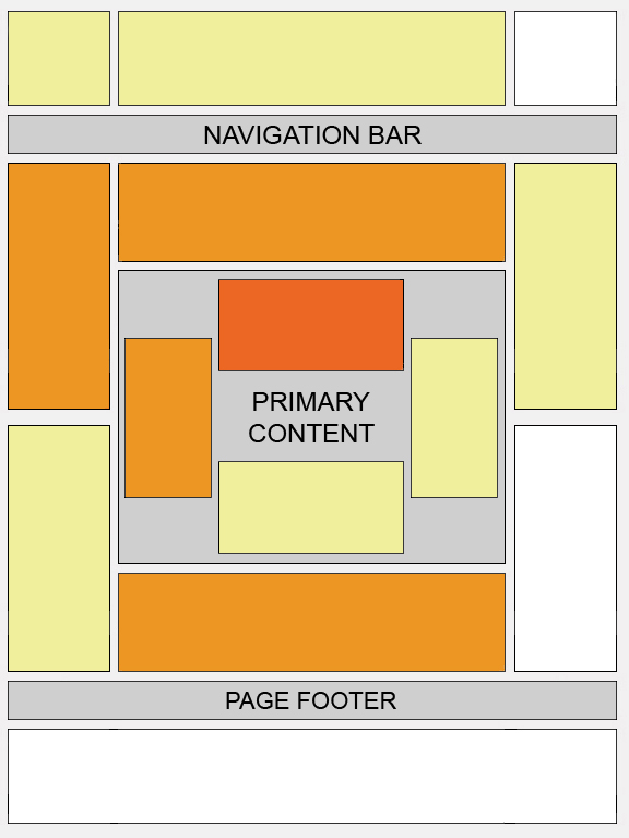
One of the tasks is to take care of Ad Coverage on your site. You already know that you can have three standard AdSense for Content units on your site. But the 300x600 are limited to only one. You can have three link units and two AdSense for Search boxes. If you are not sure of the process or wondering if and how to place Ad units, the Video below might help.
This is followed by explanation on User recommended Ad sizes, Show both text and image ads, Experimenting with Ad Colors, Optimal Ad placement and adding a AdSense for Search boxes. There are ample resource links within the post to make the task even easier, like one of our favorites, Heat Map for Pages.
Reading the article reminded me to take care of a few things about this site, starting with entirely new layout to make it more presentable and easily readable to our readers.

3 comments:
Woah! I'm really enjoying the template/theme of this site. It's simple, yet effective.
A lot of times it's difficult to get that "perfect balance" between usability and visual appeal. I must say you've done a
very good job with this. Also, the blog loads very quick for me on Firefox.
Outstanding Blog!
Here is my blog ... Belarusian Institute For Strategic Studies
That is some alarming and advantageous advice appropriate there. I cannot delay until the little humans go to beddy-bye so that I can apply and plan some of this being out.Thanks!
Advertise On Express
Good one. :))
Post a Comment